


The Forgotten Women of Times New Roman
The Forgotten Women of Times New Roman
How Times New Roman became the default font | Part One

Introduction
A weird fun fact about me is that whenever I open a document, I must find the font that matches the project before I can start writing. The first draft of a blog post? Something that says “This is just throwing word-spaghetti at the wall” like Arial. Writing a document for work? Something that says “I am a serious professional” like Garamond. When I start a new novel, I can spend an entire afternoon playing around to figure out what font feels like the story.
And yet, in all my perusing, I never choose to write in Times New Roman.
Certainly, it’s a gut reaction to years of being forced to use Times New Roman for school papers. But it also just seems so…blah. An uninteresting, basic-flavored font choice. Not even a choice, really. Just accepting what was already on the page.
While writing a document in Times New Roman is the absence of a choice (at least, prior to the 2007 change to Calibri…more on that later), someone, at some point in time, did have to choose to make Times New Roman the default font. I wanted to know: Who made that decision? When did it happen? Why did they choose Times New Roman?
It turns out the answers to those questions will take us on an unexpected journey from the early days of newspaper printing to the undervalued work of women to the surprisingly complicated process of digitizing fonts and the strife sparked by that technology. Before we begin, though, there’s a small vocabulary misconception to address first.
Typeface vs Font
It turns out, most of us use the word “font” incorrectly — in fact, I did so in the beginning of this article. “Font” and “typeface” are often used interchangeably, but there is a notable difference between the two, so let's break it down.
Typeface is what most people think of when they say “font.” It is the design of the letters, the art that differentiates Times New Roman from Comic Sans from Helvetica. A font is all the variations of that typeface: When it’s in bold or italics, heavy or light, even changing the size.1 So, Times New Roman is a typeface, and all the changes that can be made to it are fonts.
With that settled, let’s look at the birth of the typeface that has dominated our lives.
The Men of Times New Roman
If you do a basic search for the history of Times New Roman, this is the story that you’ll find: Stanley Morison was a highly regarded designer who criticized London’s newspaper the Times for its poor design in 1929. The Times fired back and said, “If you think you can do better, go for it,” so Morison designed a new font that was unveiled in 1932: The Times New Roman.2
While none of this is technically incorrect, it turns out that it is just a small sliver of a much more fascinating story behind Times New Roman.
It all did kick off with a spat between Morison and the Times; specifically, the paper was trying to sell advertising space to the typesetting company, Monotype Corporation, and instead Morison (the Typographical Advisor for Monotype) gave the paper a list of reasons why it was poorly designed and out of date. In response, the Times asked Morison to supervise a complete overhaul of the paper’s design; as a part of that project, the new typeface was created.3
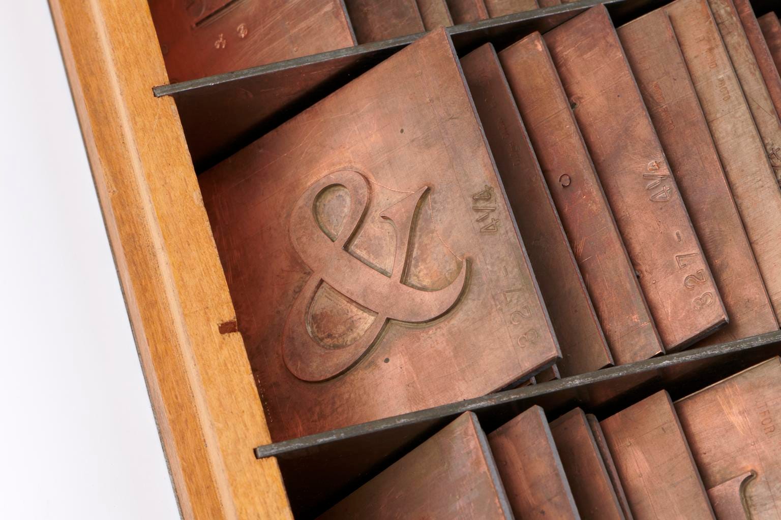
Creating a typeface wasn’t a simple process, especially back then. Morison acted more like an artistic director for Times New Roman, while a draftsman named Victor Lardent, who worked for the Times publicity department, rendered the initial drawings of the typeface. Exactly how Morison gave instructions to Lardent is unclear, but what is agreed upon is that Lardent created a set of drawings that includes 26 uppercase letters, 26 lowercase letters, and 10 old-style numerals, which are considered the original drawings of Times New Roman.4
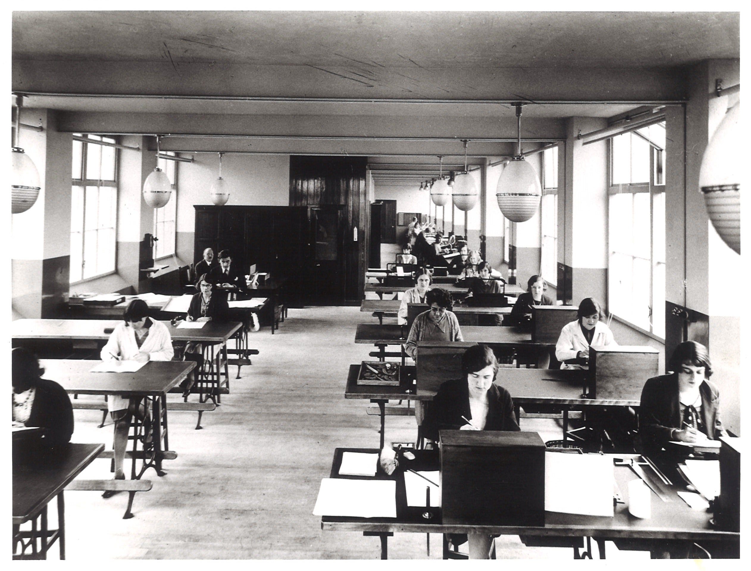
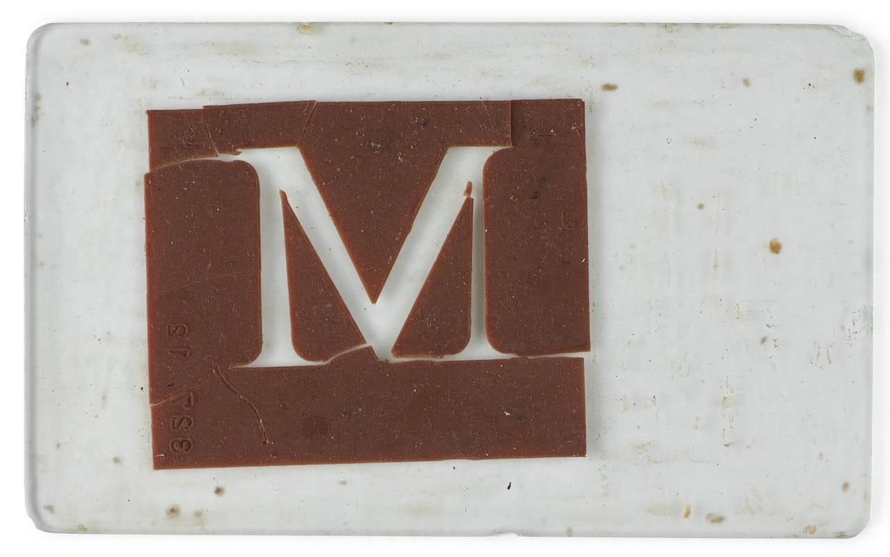
Designing the typeface of Times New Roman was only the beginning. Today, typefaces are turned into a family of fonts with bold, italic, underline, and more options through software. That is already quite the undertaking, so you can imagine the work required prior to digital typefaces. In order to create a font, each individual letter with every variation had to be drawn by hand, using precise mathematics, which were then used to produce the metal type piece that could be used by a typesetting machine for printing. This exacting work took years, and it was done by a group of people often overlooked in the history of typography: the draftswomen at the Type Drawing Office of the Monotype Corporation.
The Women of Times New Roman
The Type Drawing Office (TDO) was founded in 1910 and staffed primarily by young women.5 Most of the women only worked at the TDO for a few years in between graduating school and getting married, but there were a handful who built a career out of the work. One of these remarkable women was Dora Laing.
Laing started working at the TDO in 1922, when she was just sixteen years old.6 She stayed at the company for over forty years, until she retired when she was sixty.7 At the start of her time at TDO, she was one of many draftswomen working to create the letter drawings that would be used to produce the hot-metal typefaces. Although this work was often overlooked, staff like Laing had to have strong mathematical and logical skills, precise drawing abilities, and a good sense of proportions for the letterforms.8 The work included not only adapting the original design to a standard size that could be used to create the patterns, but also expanding the set of characters to include punctuation and symbols, as well as designing the bold and italic styles.9
Of course, the reason Monotype hired women wasn’t out of altruism, but rather financial motivation: The company could pay women workers less, sometimes under 50 percent of a man’s salary for the same work.10 Still, Laing worked her way up at the TDO offices, eventually reaching a supervisory role as head of the drawing section and receiving a separate office as a part of a small group of senior staff at Monotype.11
Laing kept detailed work diaries that provide a glimpse at what life was like at the TDO offices. Her records first mention Times New Roman in April of 1931, when Laing spent hours creating the 9-point font size.12 The work continued for over a year before the typeface made its debut in the Times on October 3, 1932.13
Getting the Word Out
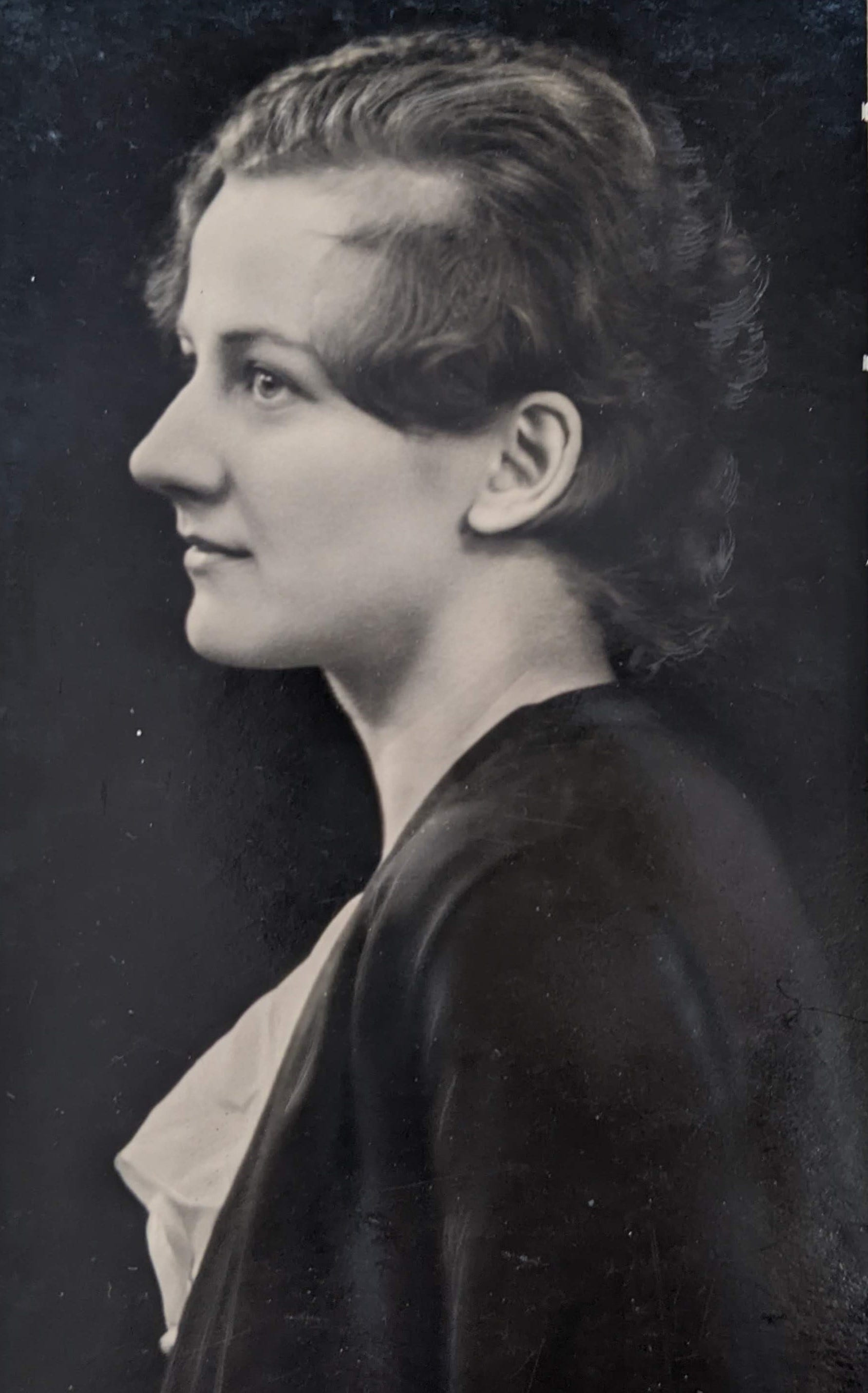
Women were not just responsible for the detailed work of creating Times New Roman, but also for its widespread popularity and use. Beatrice Warde was the long-time publicity manager of the Monotype Recorder, the trade magazine published by Monotype. Warde is a prominent figure in typographic history for a variety of reasons, most notably her speech that came to be known as “The Crystal Goblet,” which is still widely regarded as a seminal piece on typography.14 She was initially offered a job at Monotype after publishing an influential article correcting the history of Garamond types under the pen name Paul Beaujon. Monotype was shocked when a woman showed up, but nevertheless hired her.15
After a few years working as a part-time editor of the Monotype Recorder, she was promoted to publicity manager in 1929, a position she held until her retirement thirty years later.16 Her promotion coincided with the creation of Times New Roman, and Warde spearheaded a publicity campaign that contrasted the Times’ “Old Roman Type” with its “New Roman Type.” Her work created such hype that printers from all over Britain pre-ordered the typeface, even though the Times had exclusive rights to it for the first year.17
Warde’s work was a major factor in Times New Roman becoming the new typeface to use in printing. Its ubiquity was further cemented by the fact that the Times was a daily newspaper, which meant that Times New Roman grew into a familiar choice that soon became available with nearly every printer.
At the time, it would have been unusual for a typeface to be so widely available. The typefaces a printer used depended on which typesetting company they bought their equipment from — a printer using Monotype machines would only have access to the typefaces designed by Monotype. The same held true for its biggest competitor, the Linotype Company.
But a quirk with the Times meant that both typesetting companies had a version of Times New Roman. Although the newspaper had commissioned the design of Times New Roman from Monotype, the Times used machines created by Linotype to typeset the paper. As such, Linotype was allowed to adapt the typeface to fit their equipment and standards, leading to the Times Roman typeface (no “New” in the name).18
The fact that both of the largest typesetting companies in existence at the time had Times New Roman available (regardless of name variations) further contributed to the typeface becoming possibly the most widely used font. That remained true for decades after its 1932 release — all the way to the 1980s, when personal computers entered the scene.
Stay tuned for Part Two - The Font Wars, coming soon!
Be sure you’re subscribed so you don’t miss a post.
Rebecca Strehlow, “Typefaces vs. Fonts: Here’s How They’re Different.” FWD, November 8, 2021.
Meredith Mann, “Where Did Times New Roman Come From?” New York Public Library, December 9, 2014.
Sebastian Carter, One Hundred Years of Type Making: 1897-1997 (England: Monotype Typography, 1997).
Alice Savoie, “The women behind Times New Roman: The contribution of type drawing offices to twentieth century type-making,” in Journal of Design History (Oxford University Press, 2020), 2.
Alice Savoie & Fiona Ross, “Dora Pritchett, Dora Laing, Patricia Saunders…:The Invisible Women of Monotype’s Type Drawing Office,” in Baseline Shift: Untold Stories of Women in Graphic Design History, ed. Briar Levit (United States: Princeton Architectural Press, 2021), “Recruitment” section.
Savoie, “The women behind Times New Roman,” 7.
Savoie, “The women behind Times New Roman,” 7.
Savoie and Ross, “Dora Pritchett…”, “Skills” section.
Savoie, “The women behind Times New Roman,” 3.
Savoie and Ross, “Dora Pritchett…”, “Recruitment” section.
Savoie, “The women behind Times New Roman,” 7.
Savoie, “The women behind Times New Roman,” 7.
Savoie, “The women behind Times New Roman,” 7.
Sara de Bondt, “Beatrice Warde: Manners and type,” Eye Magazine, Autumn 2012, https://www.eyemagazine.com/feature/article/beatrice-warde-manners-and-type.
Sandy Jones, “Finding Beatrice Warde,” De La Warr Pavilion, last modified February 23, 2017, https://www.dlwp.com/finding-beatrice-warde/
Jones, “Finding Beatrice Warde.”
Savoie, “The women behind Times New Roman,” 12.
Greg Hitchcock, “Thirty Years of Monotype’s Times New Roman and Arial on Windows,” LinkedIn, July 18, 2020.